ShopDreamUp AI ArtDreamUp

Deviation Actions


![[$COM] Anthro Incognito](https://images-wixmp-ed30a86b8c4ca887773594c2.wixmp.com/f/65dbf436-9d90-44c6-b1ab-8f730a46331a/dbsme8n-5ed4461a-4ae0-4dd5-8ea4-e510e2ca974c.png/v1/crop/w_184,h_184,x_0,y_45,scl_0.091315136476427/__com__anthro_incognito_by_neffertity_dbsme8n-92s-2x.png?token=eyJ0eXAiOiJKV1QiLCJhbGciOiJIUzI1NiJ9.eyJzdWIiOiJ1cm46YXBwOjdlMGQxODg5ODIyNjQzNzNhNWYwZDQxNWVhMGQyNmUwIiwiaXNzIjoidXJuOmFwcDo3ZTBkMTg4OTgyMjY0MzczYTVmMGQ0MTVlYTBkMjZlMCIsIm9iaiI6W1t7ImhlaWdodCI6Ijw9MjUzNCIsInBhdGgiOiJcL2ZcLzY1ZGJmNDM2LTlkOTAtNDRjNi1iMWFiLThmNzMwYTQ2MzMxYVwvZGJzbWU4bi01ZWQ0NDYxYS00YWUwLTRkZDUtOGVhNC1lNTEwZTJjYTk3NGMucG5nIiwid2lkdGgiOiI8PTEyODAifV1dLCJhdWQiOlsidXJuOnNlcnZpY2U6aW1hZ2Uub3BlcmF0aW9ucyJdfQ.TagZxGyRhDicvtz9pSkuqLAo_DeU0uUu45AY3PS6CCs)
![[$COM] Anthro Incognito](https://images-wixmp-ed30a86b8c4ca887773594c2.wixmp.com/f/65dbf436-9d90-44c6-b1ab-8f730a46331a/dbsme8n-5ed4461a-4ae0-4dd5-8ea4-e510e2ca974c.png/v1/crop/w_92,h_92,x_0,y_23,scl_0.045657568238213/__com__anthro_incognito_by_neffertity_dbsme8n-92s.png?token=eyJ0eXAiOiJKV1QiLCJhbGciOiJIUzI1NiJ9.eyJzdWIiOiJ1cm46YXBwOjdlMGQxODg5ODIyNjQzNzNhNWYwZDQxNWVhMGQyNmUwIiwiaXNzIjoidXJuOmFwcDo3ZTBkMTg4OTgyMjY0MzczYTVmMGQ0MTVlYTBkMjZlMCIsIm9iaiI6W1t7ImhlaWdodCI6Ijw9MjUzNCIsInBhdGgiOiJcL2ZcLzY1ZGJmNDM2LTlkOTAtNDRjNi1iMWFiLThmNzMwYTQ2MzMxYVwvZGJzbWU4bi01ZWQ0NDYxYS00YWUwLTRkZDUtOGVhNC1lNTEwZTJjYTk3NGMucG5nIiwid2lkdGgiOiI8PTEyODAifV1dLCJhdWQiOlsidXJuOnNlcnZpY2U6aW1hZ2Uub3BlcmF0aW9ucyJdfQ.TagZxGyRhDicvtz9pSkuqLAo_DeU0uUu45AY3PS6CCs)


![[COM]-bigboy980](https://images-wixmp-ed30a86b8c4ca887773594c2.wixmp.com/f/ca027ada-9257-46ca-b4f0-dab44f81568d/dcmnj49-75f318e3-a8b2-4ae8-9471-56820a044796.jpg/v1/crop/w_184,h_184,x_0,y_17,scl_0.10823529411765,q_70,strp/_com__bigboy980_by_capricon132_dcmnj49-92s-2x.jpg?token=eyJ0eXAiOiJKV1QiLCJhbGciOiJIUzI1NiJ9.eyJzdWIiOiJ1cm46YXBwOjdlMGQxODg5ODIyNjQzNzNhNWYwZDQxNWVhMGQyNmUwIiwiaXNzIjoidXJuOmFwcDo3ZTBkMTg4OTgyMjY0MzczYTVmMGQ0MTVlYTBkMjZlMCIsIm9iaiI6W1t7ImhlaWdodCI6Ijw9MTQwOSIsInBhdGgiOiJcL2ZcL2NhMDI3YWRhLTkyNTctNDZjYS1iNGYwLWRhYjQ0ZjgxNTY4ZFwvZGNtbmo0OS03NWYzMThlMy1hOGIyLTRhZTgtOTQ3MS01NjgyMGEwNDQ3OTYuanBnIiwid2lkdGgiOiI8PTEwMjQifV1dLCJhdWQiOlsidXJuOnNlcnZpY2U6aW1hZ2Uub3BlcmF0aW9ucyJdfQ.YANmfvUSQJpkdlA-Hw7e0VzzIUmbxqJcq8iQgtNZQX8)
![[COM]-bigboy980](https://images-wixmp-ed30a86b8c4ca887773594c2.wixmp.com/f/ca027ada-9257-46ca-b4f0-dab44f81568d/dcmnj49-75f318e3-a8b2-4ae8-9471-56820a044796.jpg/v1/crop/w_92,h_92,x_0,y_9,scl_0.054117647058824,q_70,strp/_com__bigboy980_by_capricon132_dcmnj49-92s.jpg?token=eyJ0eXAiOiJKV1QiLCJhbGciOiJIUzI1NiJ9.eyJzdWIiOiJ1cm46YXBwOjdlMGQxODg5ODIyNjQzNzNhNWYwZDQxNWVhMGQyNmUwIiwiaXNzIjoidXJuOmFwcDo3ZTBkMTg4OTgyMjY0MzczYTVmMGQ0MTVlYTBkMjZlMCIsIm9iaiI6W1t7ImhlaWdodCI6Ijw9MTQwOSIsInBhdGgiOiJcL2ZcL2NhMDI3YWRhLTkyNTctNDZjYS1iNGYwLWRhYjQ0ZjgxNTY4ZFwvZGNtbmo0OS03NWYzMThlMy1hOGIyLTRhZTgtOTQ3MS01NjgyMGEwNDQ3OTYuanBnIiwid2lkdGgiOiI8PTEwMjQifV1dLCJhdWQiOlsidXJuOnNlcnZpY2U6aW1hZ2Uub3BlcmF0aW9ucyJdfQ.YANmfvUSQJpkdlA-Hw7e0VzzIUmbxqJcq8iQgtNZQX8)


![[Commission] Aosone](https://images-wixmp-ed30a86b8c4ca887773594c2.wixmp.com/f/2493e1d3-6d2b-4384-9bf5-46b892497a52/d73e5bg-70df1d23-c2ff-4759-aa23-e97e9c72675f.jpg/v1/crop/w_184,h_184,x_15,y_0,scl_0.23958333333333,q_70,strp/_commission__aosone_by_morgenty_d73e5bg-92s-2x.jpg?token=eyJ0eXAiOiJKV1QiLCJhbGciOiJIUzI1NiJ9.eyJzdWIiOiJ1cm46YXBwOjdlMGQxODg5ODIyNjQzNzNhNWYwZDQxNWVhMGQyNmUwIiwiaXNzIjoidXJuOmFwcDo3ZTBkMTg4OTgyMjY0MzczYTVmMGQ0MTVlYTBkMjZlMCIsIm9iaiI6W1t7ImhlaWdodCI6Ijw9NjAwIiwicGF0aCI6IlwvZlwvMjQ5M2UxZDMtNmQyYi00Mzg0LTliZjUtNDZiODkyNDk3YTUyXC9kNzNlNWJnLTcwZGYxZDIzLWMyZmYtNDc1OS1hYTIzLWU5N2U5YzcyNjc1Zi5qcGciLCJ3aWR0aCI6Ijw9ODAwIn1dXSwiYXVkIjpbInVybjpzZXJ2aWNlOmltYWdlLm9wZXJhdGlvbnMiXX0.rLaMBogdTW_HImlyYfN0qNQxN1S21aNM-h-i6azVGL4)
![[Commission] Aosone](https://images-wixmp-ed30a86b8c4ca887773594c2.wixmp.com/f/2493e1d3-6d2b-4384-9bf5-46b892497a52/d73e5bg-70df1d23-c2ff-4759-aa23-e97e9c72675f.jpg/v1/crop/w_92,h_92,x_8,y_0,scl_0.11979166666667,q_70,strp/_commission__aosone_by_morgenty_d73e5bg-92s.jpg?token=eyJ0eXAiOiJKV1QiLCJhbGciOiJIUzI1NiJ9.eyJzdWIiOiJ1cm46YXBwOjdlMGQxODg5ODIyNjQzNzNhNWYwZDQxNWVhMGQyNmUwIiwiaXNzIjoidXJuOmFwcDo3ZTBkMTg4OTgyMjY0MzczYTVmMGQ0MTVlYTBkMjZlMCIsIm9iaiI6W1t7ImhlaWdodCI6Ijw9NjAwIiwicGF0aCI6IlwvZlwvMjQ5M2UxZDMtNmQyYi00Mzg0LTliZjUtNDZiODkyNDk3YTUyXC9kNzNlNWJnLTcwZGYxZDIzLWMyZmYtNDc1OS1hYTIzLWU5N2U5YzcyNjc1Zi5qcGciLCJ3aWR0aCI6Ijw9ODAwIn1dXSwiYXVkIjpbInVybjpzZXJ2aWNlOmltYWdlLm9wZXJhdGlvbnMiXX0.rLaMBogdTW_HImlyYfN0qNQxN1S21aNM-h-i6azVGL4)


Description
This is a concept drawing of my current 2014 rendition of OC Lumina. The biggest change is that she's completely drawn as a dragoness now rather than a Flygon, as I'm moving away from Pokemon-based designs. Lumina still has a pair of goggles as a nod to her original Flygon design, as well as keeping the heart necklace that she had since... ever. She has also received a bit of anatomy changes to better fit my liking too. The armor is based of this: [ www.daevasreport.com/wp-conten… ]
This piece also has been painted in a similar style to my previous OC Laurithia piece, though this time I focused on having the composition and perspective focused just on Lumina.

Props towards Knockwurst for his awesome tutorials! The ones that really helped me while painting this was
Character Exposure and Zac & Riven Time-lapse.
----------------------------------------------------------------------
Software: Paint Tool Sai / Photoshop CS6
Hardware: Wacom Bamboo Tablet
Stocks used:
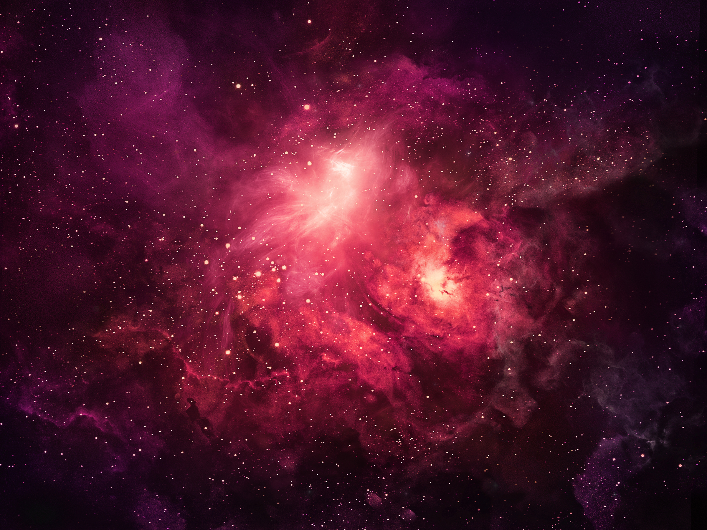
* Nebula BG: fc06.deviantart.net/fs70/f/201…
This piece also has been painted in a similar style to my previous OC Laurithia piece, though this time I focused on having the composition and perspective focused just on Lumina.
Props towards Knockwurst for his awesome tutorials! The ones that really helped me while painting this was
Character Exposure and Zac & Riven Time-lapse.
----------------------------------------------------------------------
Software: Paint Tool Sai / Photoshop CS6
Hardware: Wacom Bamboo Tablet
Stocks used:
* Nebula BG: fc06.deviantart.net/fs70/f/201…
Image size
3000x4300px 12.22 MB
© 2014 - 2024 Juustus
Comments25
Join the community to add your comment. Already a deviant? Log In
This is gorgeous, with a real 1970's sci-fi/fantasy poster feel in terms of subject, pose, palette and contrast. The flat hex fill pattern sort of jumps out, though, since it doesn't conform to her 3D shape or bend with her joints. Other than that, her sword obscures areas of her body in a way which makes her pelvis look a bit anatomically off, and its form immediately makes me think of late-series Final Fantasy swords which may or may not be the intent but I find it a little distracting. While unnecessary, I feel that some landscape at the very bottom of this piece would add more context and drama.
The overall effect of this piece is striking and charismatic, and I find that most of the technical issues only spring up if you spend time critically thinking about it. I can smell the bones of excellence here, and I look forward to watching this artist develop.